


Cue the nuclear shills that will handwave away any legitimate concern with wishful thinking and frame the discussion as solely pro/anti fossil, conveniently pretending that renewables don’t exist.
ETA:
Let’s look at some great examples of handwaving and other nonsense to further the nuclear agenda.
Here @[email protected] brings up a legitimate concern about companies not adhering to regulation and regulators being corrupt/bought *cough… Three Mile Island cough*, and how to deal with that:
So uh, turns out the energy companies are not exactly the most moral and rule abiding entities, and they love to pay off politicians and cut corners. How does one prevent that, as in the case of fission it has rather dire consequences?
So of course the answer to that by @[email protected] is a slippery slope argument and equating a hypothetical disaster with thousands if not millions of victims and areas being uninhabitable for years to come, with the death of a family member due to faulty wiring in your home:
Since you can apply that logic to everything, how can you ever build anything? Because all consequences are dire on a myopic scale, that is, if your partner dies because a single electrician cheaped out with the wiring in your building and got someone to sign off, “It’s not as bad as a nuclear disaster” isn’t exactly going to console them much.
At some point, you need to accept that making something illegal and trying to prosecute people has to be enough. For most situations. It’s not perfect. Sure. But nothing ever is. And no solution to energy is ever going to be perfect, either.
Then there’s the matter of misleading statistics and graphs.
Never mind the fact that the amount of victims of nuclear disasters is underreported, under-attributed and research is hampered if not outright blocked to further a nuclear agenda, also never mind that the risks are consistently underreported, lets leave those contentious points behind and look at what’s at hand.
Here @[email protected] shows a graph from Our World in Data that is often thrown around and claims to show “Death rates by unit of electricity production”:
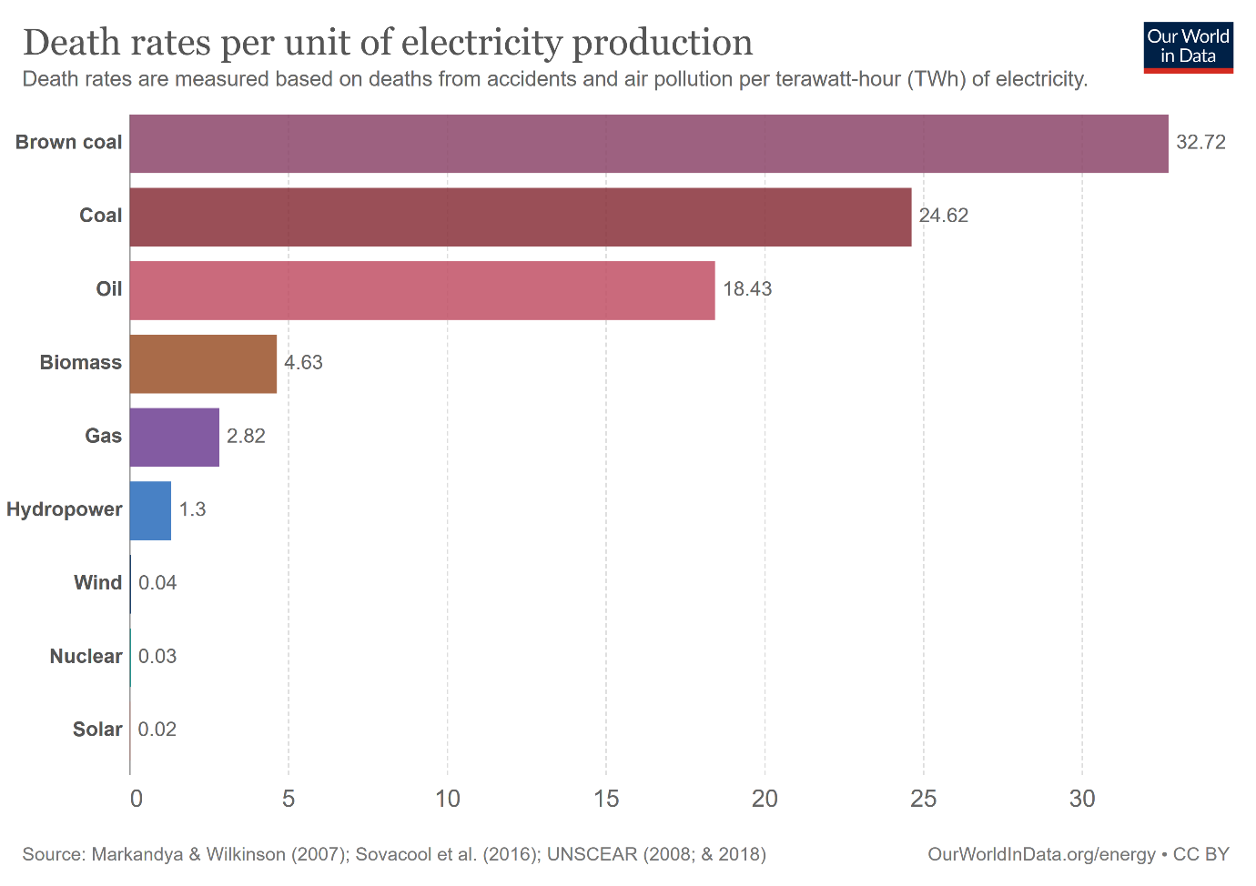
Seems shocking enough and I’m sure in rough lines, the proportions respective to one another make sense to some degree or another.
The problem however is that the source data is thrown together in such a way that it completely undermines the message the graph is trying to portray.
According to Our World in Data this is the source of the data used in the graph:
Death rates from energy production is measured as the number of deaths by energy source per terawatt-hour (TWh) of electricity production.
Data on death rates from fossil fuels is sourced from Markandya, A., & Wilkinson, P. (2007).
Data on death rates from solar and wind is sourced from Sovacool et al. (2016) based on a database of accidents from these sources.
We estimate deaths rates for nuclear energy based on the latest death toll figures from Chernobyl and Fukushima as described in our article here: https://ourworldindata.org/what-was-the-death-toll-from-chernobyl-and-fukushima
We estimate death rates from hydropower based on an updated list of historical hydropower accidents, dating back to 1965, sourced primarily from the underlying database included in Sovacool et al. (2016). For more information, see our article: https://ourworldindata.org/safest-sources-of-energy
Fossil fuel numbers are based on this paper which starts out by described a pro-nuclear stance, but more importantly, does a lot of educated guesstimating on the air-pollution related death numbers that is straight up copied into the graph.
Sovacool is used for solar and wind, but doesn’t have those estimates and is mainly limited to direct victims.
Nuclear based deaths is based on Our World in Data’s own nuclear propaganda piece that mainly focuses on direct deaths and severely underplays non-direct deaths.
And hydropower bases deaths is based on accidents.
So they mix and match all kinds of different forms of data to make this graph, which is a no-no. Either you stick to only accidents, only direct deaths or do all possible deaths that is possibly caused by an energy source, like they do for fossil fuels.
Not doing so makes the graph seem like some kind of joke.
I was wondering myself as well so I got you.
Basically what happened was that these were technically two separate cases with two separate jury pools to decide the amount for damages.
One jury pool came to the decision that there were damages and awarded $50k to each individual in couple 1 (totaling $100k) while the other jury pool independently decided that no damages should be awarded based on the same evidence.
Keep in mind that this region is generally pretty hostile towards LGBTQ+ people. The judge had the option to overrule a jury if they find that the decision doesn’t match the evidence in the case.
The lawyer of this lady is actually hoping for that in the case that lead to a $100k damages award as per the quote below.
Source